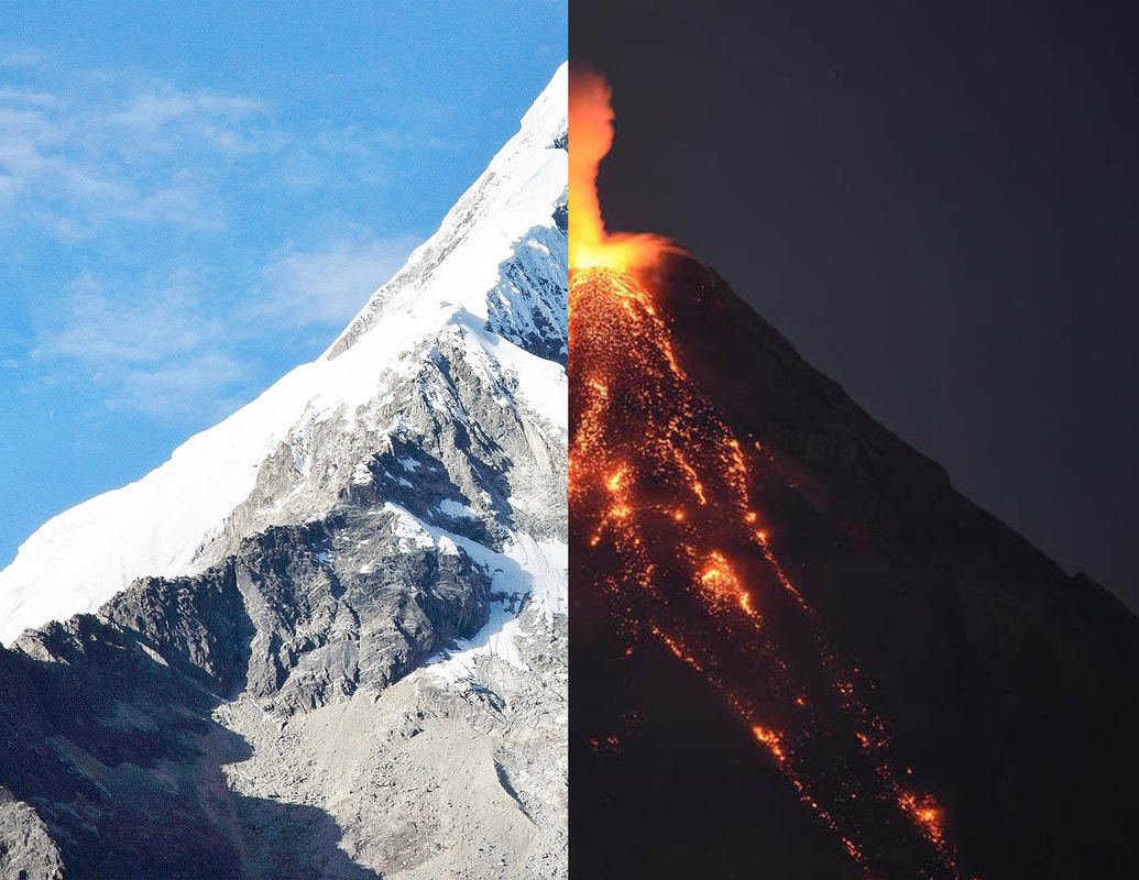
Fire and Ice (Hard Contrast)
Student Portfolio: Portfolio Piece 1
Project Name: Fire and Ice (Hard Contrast)
Student Name: DJ Cope
Date Completed: 10/09/19
My three goals for this assignment were:
Project Name: Fire and Ice (Hard Contrast)
Student Name: DJ Cope
Date Completed: 10/09/19
My three goals for this assignment were:
- To use hard contrast to exemplify the differences between fire and ice, the mountain and the volcano
- To learn how to use layer masks to erase things without permanently erasing them
- To get a decent grade by following Ms. White’s instructions
I did the following planning/research to accomplish my goals:
- I found the images using google (they had to look somewhat similar)
- I read a couple of tutorials about layer masks and how to effectively use them
- Changing how I scaled the images. I scaled up the volcano, which made it look blurry, detracting from the overall presentation of the image.
- Adding color filters to bring out the lava and the snow, to really accentuate the theme
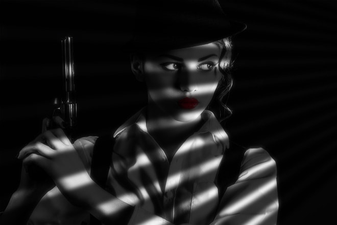
Sin City Movie Poster (Cinematic Displacement)
Student Portfolio: Portfolio Piece 2
Project Name: Cinematic Displacement: Sin City Movie Poster
Student Name: DJ Cope
Date Completed: 10/09/19
My three goals for this assignment were:
This assignment didn’t go as well as I hoped. I messed up the displacement file, so all the shadows look off, and make the poster look 2d and artificial. If I was to redo the project, I would take a lot more time on the displacement file to make it the best I could. I would also adjust the shadows to make sure that the red lipstick would be much more visible.
Project Name: Cinematic Displacement: Sin City Movie Poster
Student Name: DJ Cope
Date Completed: 10/09/19
My three goals for this assignment were:
- To learn how to create cool effects using Displacement files
- To learn how to create projects using the Noir style (sort of)
- To learn how much of a difference color can make in a project
- I read the tutorial
- I made a folder for the project before we even started it
- I would redo the Displacement, it makes the woman look like a photo and not an actual person (it makes her look 2d)
- I would adjust the shadows so that her lipstick would be visible
This assignment didn’t go as well as I hoped. I messed up the displacement file, so all the shadows look off, and make the poster look 2d and artificial. If I was to redo the project, I would take a lot more time on the displacement file to make it the best I could. I would also adjust the shadows to make sure that the red lipstick would be much more visible.
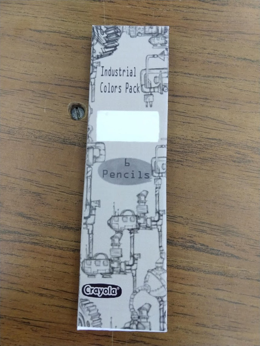
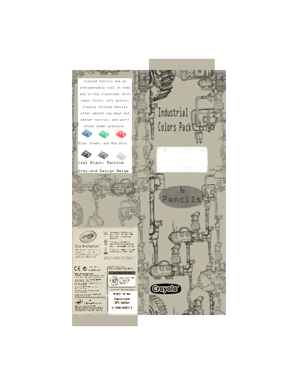
Industrial Colored Pencil Pack (Custom Crayola Colored Pencil Box Design)
|
|
Student Portfolio: Portfolio Piece 3
Project Name: Crayola Colored Pencil Box Design (Industrial)
Student Name: DJ Cope
Date Completed: 10/09/19
My three goals for this assignment were:
This assignment went pretty well, considering how many obstacles I ran into, many of which were of my own doing. I’m extremely proud of how the front turned out, and how the machinery connected even though I only had 5 shapes to use for it. I wish that I could’ve made sure it connected on the sides too, but I didn’t have enough time. I also wish that I could’ve made sure that all the information on the back was legible, but considering how long it took to change the coloring on it, it didn’t turn out that badly. Overall, I’m very happy with how well it turned out, and I hope we do more projects like this in the future.
Project Name: Crayola Colored Pencil Box Design (Industrial)
Student Name: DJ Cope
Date Completed: 10/09/19
My three goals for this assignment were:
- To create a Crayola Colored Pencil Box (CCPB) that was completely different from the typical CCPB
- To create something that fulfills its purpose, (aka it can hold colored pencils) and that I can actually pick up and hold in my hand
- To learn how to change the color scheme of an image with text without deleting the text/recreating the image
- I took measurements of a typical CP (Colored Pencil) and did the math that I needed to make sure that my CCPB would fit those pencils
- I drew out a blueprint/basic plan of how I would have to format the photoshop file
- Making sure that the machinery matches up on all sides and connects
- Making sure that the information on the back is legible
- Making sure that the colors match up
- Cutting out the white spot in the front like I was considering
This assignment went pretty well, considering how many obstacles I ran into, many of which were of my own doing. I’m extremely proud of how the front turned out, and how the machinery connected even though I only had 5 shapes to use for it. I wish that I could’ve made sure it connected on the sides too, but I didn’t have enough time. I also wish that I could’ve made sure that all the information on the back was legible, but considering how long it took to change the coloring on it, it didn’t turn out that badly. Overall, I’m very happy with how well it turned out, and I hope we do more projects like this in the future.
